
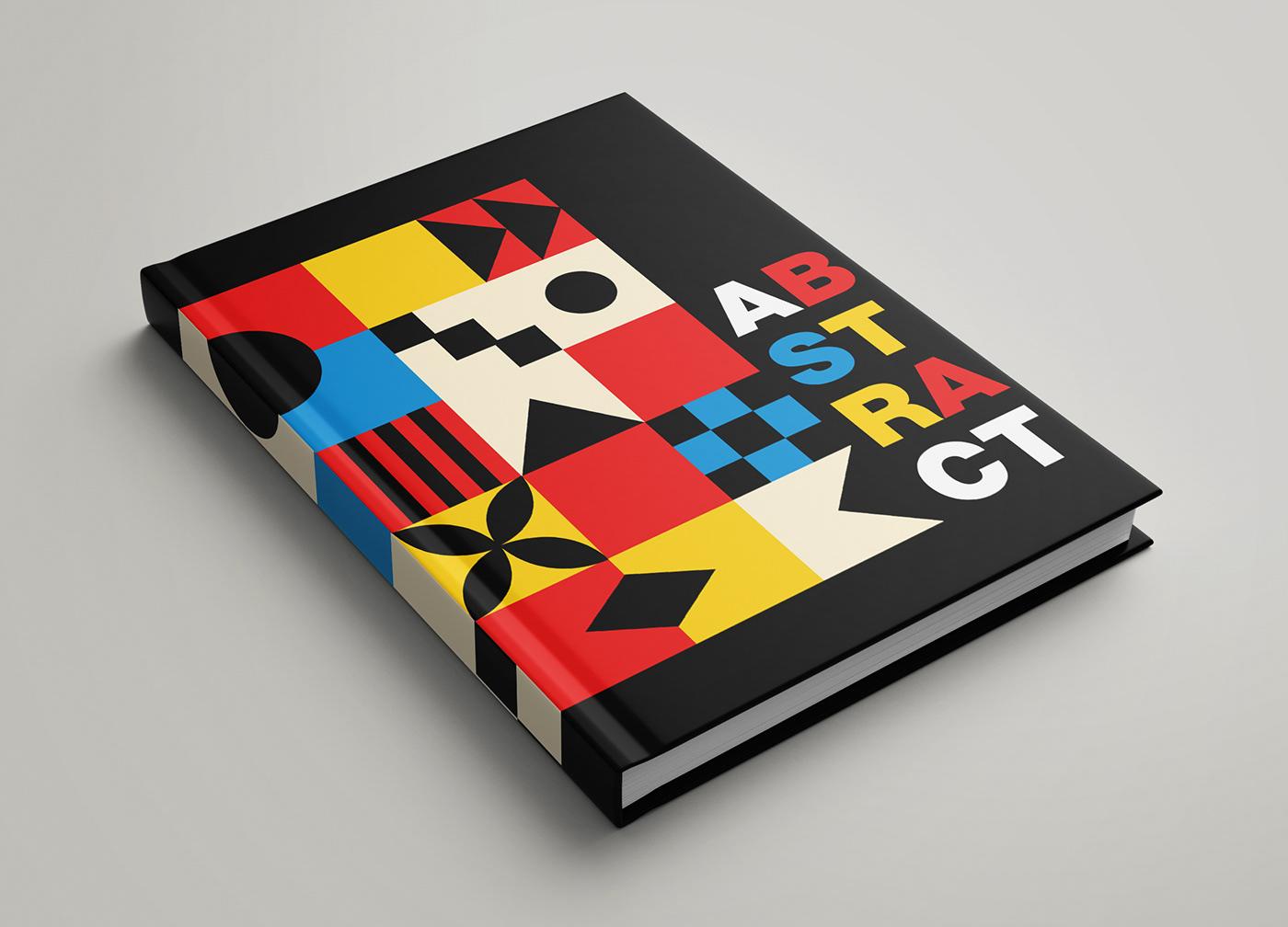
Bestselling books often follow similar cover design patterns because familiar visuals help readers instantly recognize genres, trust the content, and make faster buying decisions. Publishers and designers use proven design formulas based on reader psychology, marketing data, and sales trends to improve discoverability and conversions.
When readers browse online bookstores or physical shelves, they usually spend only a few seconds evaluating a book. During that short time, the cover acts as the book’s first impression. Research from the publishing and retail industry shows that visually recognizable covers improve click-through rates, increase perceived professionalism, and help readers connect emotionally with the content before reading a single page. Today, publishers and authors increasingly rely on professional book cover design services because competition in the publishing industry has become extremely intense. With millions of titles available across Amazon Kindle, Apple Books, and traditional bookstores, a cover must instantly communicate genre, mood, and credibility. This explains why bestselling books within the same category often look visually similar. These patterns are not signs of unoriginality; they are strategic design decisions based on reader expectations and proven market performance.
Book Cover Design Patterns
Book cover design patterns are recurring visual elements commonly used across successful books in specific genres. These patterns may include typography styles, color schemes, image placement, composition structures, or illustration techniques.
For example:
- Thriller books often use dark backgrounds and bold fonts
- Romance novels commonly feature warm tones and emotional imagery
- Fantasy covers usually contain cinematic illustrations and symbolic visuals
- Self-help books rely on minimalistic layouts and large typography
According to publishing market research, genre consistency helps readers quickly identify the type of experience a book offers. Readers unconsciously associate certain visuals with specific emotions and storytelling styles. This instant recognition is especially important in digital marketplaces where users scroll rapidly through hundreds of book thumbnails. A 2024 publishing behavior study found that nearly 60% of readers consider cover design a major factor when deciding whether to explore a book further. This demonstrates how visual familiarity directly influences reader behavior and commercial success.
Why Familiar Cover Designs Influence Reader Psychology
Human brains naturally prefer familiarity. In psychology, this concept is called “cognitive fluency,” where people trust visuals they can process quickly and easily. Book covers that resemble successful titles within a genre reduce uncertainty and create emotional comfort for readers.
For example, if a reader enjoys mystery novels, they already expect:
- Dark visuals
- Suspenseful imagery
- Bold typography
- Minimalist tension-focused layouts
When a new thriller book uses these familiar elements, the reader immediately understands the genre and emotional tone. This familiarity increases trust and improves the chances of purchase.
Several psychological factors explain why similar cover patterns work:
- Familiarity reduces buying hesitation
- Readers recognize genres instantly
- Similar visuals create emotional expectations
- Consistent branding increases perceived professionalism
- Strong visual hierarchy improves attention span
Studies in consumer marketing show that products aligned with customer expectations generally outperform completely unfamiliar presentations. The same principle applies to books.
How Genre Expectations Shape Bestselling Covers
Genre expectations are among the biggest reasons bestselling books follow similar visual formulas. Readers subconsciously compare new books with titles they already know and trust.
Thriller and Mystery Covers
Thriller books commonly use:
- Black, gray, or deep blue backgrounds
- Sharp typography
- Suspenseful imagery
- Red accent colors for tension
These visual elements signal danger, suspense, and emotional intensity.
Romance Covers
Romance novels often feature:
- Soft lighting
- Warm or pastel tones
- Elegant typography
- Emotional character imagery
These designs create feelings of intimacy and emotional connection.
Fantasy and Science Fiction Covers
Fantasy books frequently include:
- Cinematic digital artwork
- Dramatic landscapes
- Symbolic weapons or magical elements
- Metallic or decorative fonts
These visuals help communicate imagination and adventure.
Business and Self-Help Covers
Professional nonfiction books usually prioritize:
- Minimalism
- Large readable titles
- Neutral color schemes
- Clean typography
Research suggests that simple layouts improve authority perception in nonfiction categories.
Why Publishers Repeat Successful Cover Formulas
Publishing is both creative and data-driven. Since producing books involves financial investment, publishers carefully analyze which cover styles generate the strongest results.
Modern publishing teams often study:
- Reader engagement metrics
- Online click-through behavior
- Conversion rates
- Retail performance
- Social media interaction trends
This data helps publishers identify visual patterns associated with high-performing books. As a result, many bestselling titles adopt similar design structures because they already have proven commercial success.
The rise of online book publishing services has further accelerated this trend. Digital platforms encourage covers optimized for thumbnail visibility, mobile readability, and algorithm-driven browsing behavior. Covers now need to perform effectively not only on bookstore shelves but also on smartphone screens and recommendation feeds.
The Importance of Typography in Bestselling Covers
Typography is one of the most influential elements in book cover design. Readers often notice the title before any imagery, especially when browsing online marketplaces.
Different font styles create different emotional impressions:
- Serif fonts suggest authority and tradition
- Sans-serif fonts appear modern and bold
- Script fonts create elegance and romance
- Decorative fonts support fantasy themes
Effective typography strategies include:
- Large readable text
- Strong contrast against backgrounds
- Clear visual hierarchy
- Limited font combinations
Industry experts emphasize that typography must remain readable even in small thumbnail form. If readers cannot easily identify the title, engagement drops significantly.
How Color Psychology Impacts Book Sales
Colors strongly influence emotional reactions and purchasing behavior. Publishers use color psychology strategically to match genre expectations and audience emotions.
Common Color Associations
| Color | Emotional Meaning |
|---|---|
| Black | Mystery, power |
| Red | Passion, urgency |
| Blue | Trust, calmness |
| Yellow | Optimism, energy |
| White | Simplicity, clarity |
| Purple | Creativity, fantasy |
For example:
- Horror books often combine black and red
- Romance novels use warm pinks and soft neutrals
- Business books favor blue for trustworthiness
- Fantasy covers use darker, dramatic palettes
Studies in branding psychology indicate that consistent color usage improves memorability and emotional connection.
How Digital Publishing Changed Cover Design
Digital publishing transformed how readers discover books. Since many readers browse through mobile devices, covers must now perform effectively in thumbnail size.
This shift has created several major design trends:
- Larger typography
- Simpler compositions
- High contrast visuals
- Minimal distractions
- Strong focal points
Social media platforms like BookTok and Instagram also influence visual trends. Books with aesthetically appealing covers often receive more shares, recommendations, and viral visibility.
According to publishing industry reports:
- Ebook sales continue growing globally
- Mobile-first browsing dominates reader behavior
- Thumbnail readability significantly affects click-through rates
This explains why modern bestselling covers often prioritize clarity over complexity.
Can Unique Book Covers Still Become Bestsellers?
Although familiarity matters, originality still plays an important role. Some iconic covers became successful because they introduced fresh visual concepts while still maintaining genre clarity.
Successful unique covers usually:
- Break trends carefully
- Maintain recognizable genre signals
- Use memorable focal points
- Create a strong emotional impact
The most effective covers balance creativity with reader expectations rather than ignoring market psychology entirely.
Case Study: How Cover Redesign Increased Book Sales
One of the clearest examples of cover design impact can be seen in the self-publishing industry. A well-known independent thriller author redesigned a poorly performing book cover after receiving feedback that the original design looked “too generic” and failed to communicate suspense effectively.
Original Cover Problems
The first version included:
- Small typography
- Bright colors unrelated to the thriller genre
- Overcrowded visual elements
- Weak contrast in thumbnail size
As a result, the book struggled to gain visibility despite positive reviews.
Redesign Strategy
The updated cover introduced:
- Dark blue and black tones
- Bold uppercase typography
- A mysterious silhouette image
- Cleaner composition with stronger contrast
Results After Redesign
Within three months:
- Click-through rate reportedly increased by over 40%
- Sales significantly improved
- Reader engagement on Amazon grew noticeably
- Social media shares increased due to a stronger visual appeal
This case demonstrates how genre-aligned design patterns directly affect discoverability and buyer confidence.
Conclusion
Bestselling books often follow similar cover design patterns because those patterns are rooted in reader psychology, genre recognition, and proven marketing performance. Familiar visuals help readers instantly understand a book’s tone and category, making purchasing decisions faster and easier. At the same time, successful cover design is not about copying trends blindly. The strongest covers combine recognizable genre elements with unique creative touches that help books stand out in crowded marketplaces. As digital publishing continues evolving, cover design will remain one of the most important tools for improving discoverability, reader trust, and commercial success.
FAQs
Why do bestselling books have similar covers?
They use familiar visual patterns because readers quickly recognize genres and feel more confident purchasing books that meet their expectations.
Do book covers really affect sales?
Yes. Strong cover design improves click-through rates, reader trust, and online discoverability.
What makes a book cover look professional?
Professional covers use balanced layouts, strong typography, genre-appropriate imagery, and clear visual hierarchy.
Why are minimalist book covers becoming popular?
Minimalist covers perform better on digital platforms because they remain readable and visually effective in thumbnail size.
How important is typography in book cover design?
Typography is extremely important because readers often notice the title first, especially in online bookstores.

 Arabic
 French
 Spanish
 Portuguese
 Deutsch
 Turkish
 Dutch
Dutch
 Italiano
 Russian
 Romaian
 Portuguese (Brazil)